 Improve this document
 Create an issue
 Edit on GitHub
Data Visualization
Lemur catta is native to Madagascar; but just to make sure, let’s check where else it can be found
ggplot() +
  geom_sf(data = world_map) +
  geom_point(data = gbif_download,
             aes(x = decimallongitude,
                 y = decimallatitude),
             shape = "+",
             color = "red") +
  theme_bw()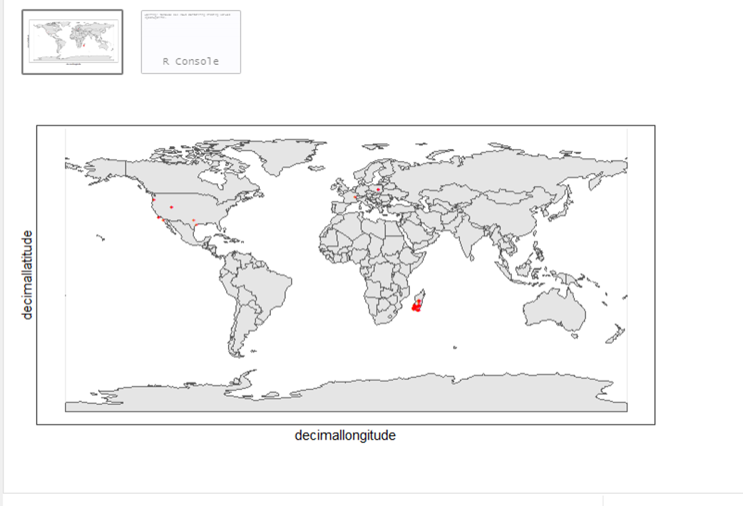
From initial look, what’s wrong with the distribution of the Lemur?
Wheps! seems like there are unusual occurrences outside its native range. Let’s check further.
table(gbif_download$countrycode)