 Improve this document
 Create an issue
 Edit on GitHub
Exercise 10 - Visualize model results in geographic space
a) Under “Visualize Model Results” select the “Map Prediction” radio button.
b) If you look to the right above you map, you’ll see 3 drop down menus. Click on the “Current Model” dropdown menu and select the model that performed best according to your model evaluation statistics.
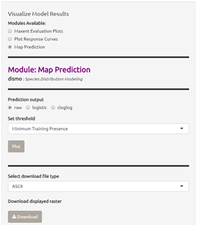
c) Under “Prediction Output” select the “raw” radio button.
e) From the “Set threshold” dropdown menu, choose the threshold (minimum training presence or 10 percentile training) that yielded the best omission rate accord to the model evaluation in Exercise 6.
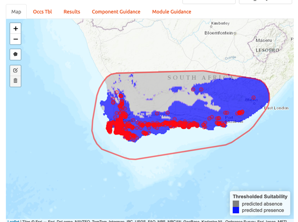
f) Click on “Plot”. Your thresholded binary model results for the calibration/training region should appear in the display window with the extent of the training region denoted in red (an example is below).
g) Now, take a few minutes to explore the three alternate model projection options. That is, if your best evaluated model was LQHP_2 with a MTP threshold, then take a minute to visualize LQHP_2 with a 10 Percentile Training Threshold, LQHP_1 with a MTP, and LQHP_2 with a 10 Percentile Training Threshold. What similarities do you see across the visualizations? Are there major differences?
h) Save your model prediction. First, be sure to return all settings to reflect your selected model and threshold. Then, select “ASCII” from the “Select download file type” dropdown menu, and press “Download”. Save the file to your working project folder.