Exercise 9 - Visualizing Model Results
Now that we’ve seen the numbers, let’s get an idea of what our niche models look like in terms of inferred response curves and geography. NOTE: Remember to click on the “Component Guidance” tab if you need a refresher overview on niche/distributional models and the “Module Guidance” tab if you need additional information about the occurrence data partitioning methods.
a) Click on “7 Visualize” in the browser window in which Wallace is running.

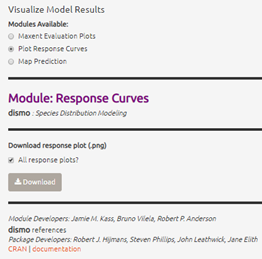
b) Under “Visualize Model Results” select the “Plot Response Curves” radio button.
c) In the “Results” window to the right, you’ll see a single plot for the first environmental variable. To view variable responses for the model you have decided is the best fit, select that model under “Current Model” at the far right side of the plot. To view a different response curve for another environmental variable, click on the “Current Env Variable” dropdown menu and select the variable you want to view. If you wish to view the response curves for all variables simultaneously, we will need to download the plots.
d) Save the response plots. Under “Download response plot (.png)”, check the box next to “All response plots?” then Download. Open the plots to examine all response plots side-by-side. How do they look? Are they roughly bell-shaped, suggesting the model has completely characterized suitability of all the variables you used? Are the responses fairly smooth, or are they jagged, like the model is overfit?